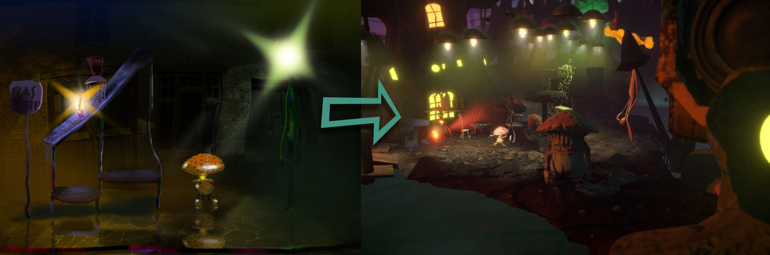
The Shrooms demo runs on Unity’s mobile-friendly Universal Render Pipeline (URP), which doesn’t support volumetric fog and lighting like the High Definition Rendering Pipeline (HDRP). An early design decision was to lock the camera to only about 20 degrees of rotation off the default view axis. This allows many computationally-inexpensive (oldschool) cheats and tricks to create rich atmosphere. My mantra was: “HDRP in URP.”
Lighting
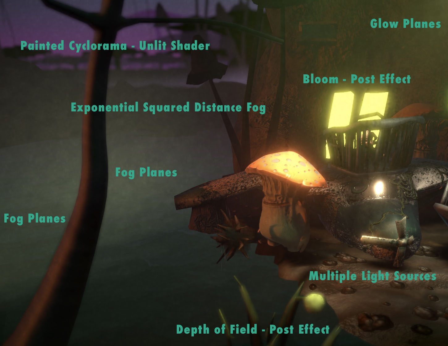
In the Shrooms world, lightbulb is a job. Every light source is a glowing, bioluminescent mushroom person. The Copenhagen-inspired strings of street lamps that draw the viewer through the level each contain an animated Bulb Guy (created by Niek Meffert) sitting in a little wire gondola underneath a beat-up reflector. It’s a living.
He/she, and the remainder of the lamp, are set to not cast shadows, and contain a downward-facing Spot Light. There are 37 in all, in addition to a wan Directional Light sun from the left—which is a problem, because Unity’s URP has a hard limit of 8 lights per mesh. The Unity Terrain tool splits the ground into a couple dozen smaller tiles, but the initial result was most of the light sources being simply ignored by the ground mesh, and glows often visibly sliced off where they crossed tile boundaries. Baked Lightmaps and realtime lighting in URP both share the lights-per-mesh limit.

The solution was to place pieces of flattened human-world junk along the ground, to disguise the boundaries and ensure that every light creates a visible effect. The junk shader uses a Texture stitched together in Photoshop from derelict building photographs, with a rough Normal Map.
Like the noise functions, the Texture is applied in World Space, allowing the same low-res crumpled square of debris to be recycled, stretched and resized ad-nauseum, with the Texture remaining undistorted and matching up perfectly at object boundaries. I’ve been a big fan of using world space shaders to create visual variety in instanced models since The House of Time–which, yes, will finally get some big updates this summer.
Simple exponential-squared Distance Fog ties the effects together, creating additional depth, and a Bloom post effect softens the edges of windows and other bright objects to match. A Depth of Field post effect further softens objects in the extreme foreground, adding to the murky intimacy, and the deep background is a hand-painted backdrop by Natasha Beck in an Unlit Shader.
Faking Volumetrics
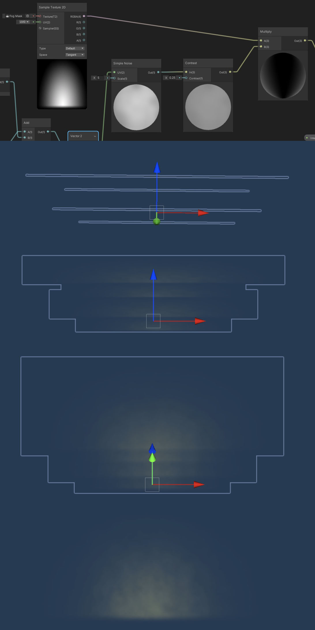
It’s a not-so-dirty not-so-secret that even in high-end film compositing software volumetric lighting is faked by slicing the camera’s Z-axis into stacked, transparent planes at render time. This is what Shrooms does manually. Using the limited camera view and careful placement, patches of fog are created with a shader on a small stack of transparent planes. The shader multiplies a half-circle gradient alpha Texture with a procedural noise function. The noise slowly migrates up the Y-axis, as if mist were rising off the swamp. The noise is generated in World Space, so that scaling, squashing or stretching the fog planes creates no distortion to the noise pattern.

Light glows work the same way. Each light fixture model contains a set of three planes: Two larger, colored, more transparent ones in front and back, and a smaller, more opaque, white plane in the center. The alpha Texture is a narrow cone gradient, aimed downward, and the World Space noise function slowly falls, like misty drizzle. The bright spotlights in the arena and cafe are just variants on this scheme, and a circular glow is used in a couple of additional spots.