In Niek Meffert’s concept for Shrooms, giant mushroom people battle giant plant people in their swampy homeland, while grinding the remnants of humanity under their figurative boots. The dev team was Meffert, Lucas Oliveira, Sabrina Christiansen, Kaspar Dahl, Natasha Beck, and myself as Lighting Designer and Technical Artist. You can check out the demo (Mac & Windows) on Itch.io here.
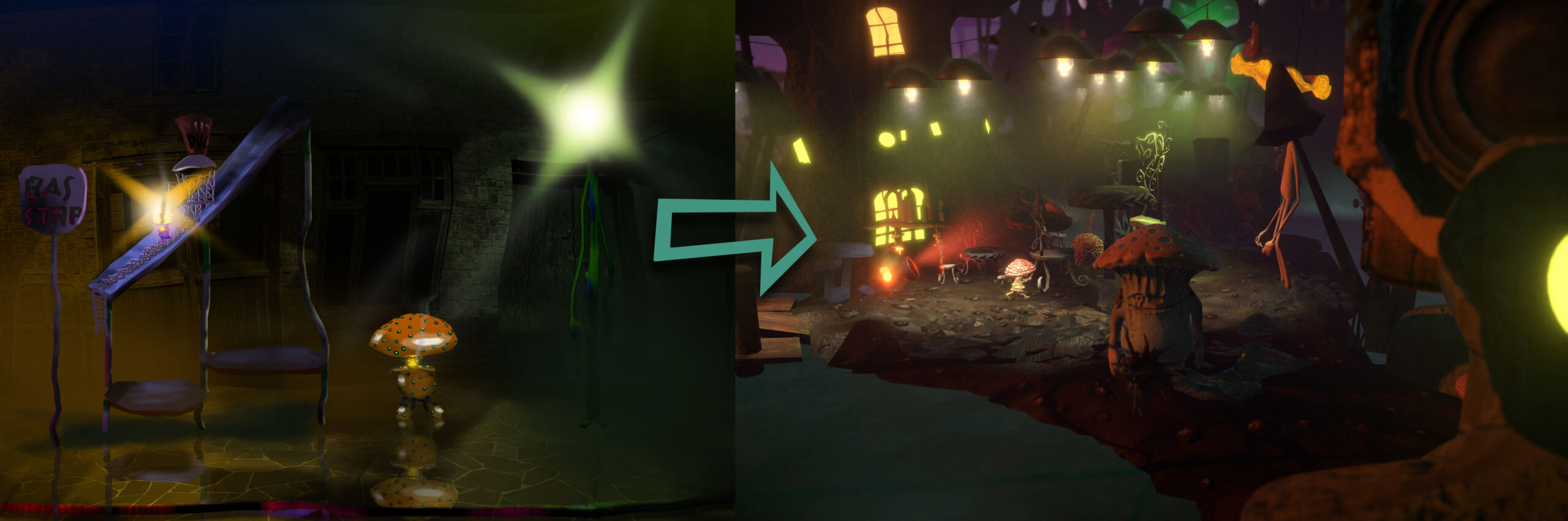
The objective was to create a bright, colorful, murky, fungal setting. Fungus suggests bright, “sickly-sweet” tertiary colors, and we wanted an organic, lively scene. However, with too much clashing color the scene would have become busy and unreadable. Just finding your way and knowing what to interact with would have meant a frustrating cognitive load.
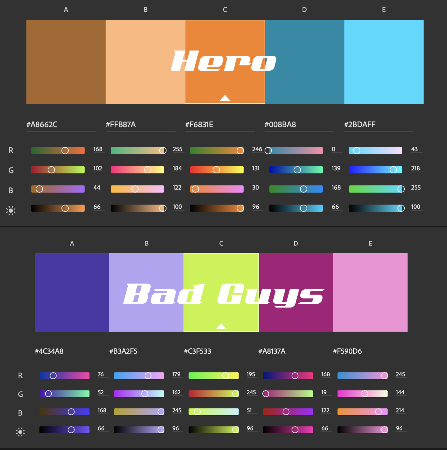
For that reason, I worked with the team to enforced certain rules to control user attention. The main character is in complementary colors. The bad guy’s color palette is a high-saturation split complement. NPC characters each have a single, dominant color. Non-interactive parts of the scene favor muted, analogous colors.
Lighting rules were also held to. Unimportant parts of the level fall back into mist and shadow. The character path is comparatively well lit, always suggesting where the player can and can’t go. Interactive parts of the scene (usually just-for-fun destructibles) pop comparatively, while others harmonize.
Forms avoid straight lines, with blobby, asymmetrical and impractical shapes but—importantly—recognizable outlines. Classic Warcraft games, and the art of Chris Sanders (Lilo & Stitch) were strong references here.
And of course, what’s the point of a game without asshole physics?