Notes on Installing Blosxom

Blosxom’s official installation instructions are concise and straightforward. Installation required only a standard FTP client and a text editor. (I used JEdit with the FTP plugin installed.) The blosxom.cgi script ran as soon as it was installed; SpaceToast.net’s ISP, Laughing Squid, did not require it to be “blessed” first.

Configuration was straightforward. The settings are stored in the script itself. Many settings can be left at the defaults.

Fitting the Space Toast Pages’ existing layout into the Blosxom engine was equally straightforward. An old Space Toast Page was sliced into three “flavor” files, the head.html, story.html and foot.html files, with Blosxom markup tags added where dynamic content should be placed. (An additional date.html flavor file is required. On the Space Toast Pages it is an empty file, as date stamps are part of the story template.)

Blosxom stores posts as plain text files in the “data directory” and serves them as html files or rss feeds from the “blog directory.” The Space Toast Pages keep everything in SpaceToast.net/stp. Surprisingly, this doesn’t cause a problem. Any of the posts on the Space Toast Pages can be accessed as raw text files by simply substituting .txt for .html in the address bar. The text file is a real file sitting on SpaceToast.net; the html file is a fake created by Blosxom when it’s requested. An .htaccess file makes the ephemeral page look real — more on that in the next post on cgi cloaking.

STP Relaunched

The Space Toast Page has become the Space Toast Pages, a “journal of journals” on Rasmussen’s various obsessions and experiments. The weekly issue format has been discarded in favor of a categorized, feed-friendly, commentable series of blogs and sub-blogs running on the free and open source Blosxom content management system. Thank you as always for reading, and welcome back!

Build Notes: Tape Case Bike Light

Issue 177, for the week of 8/27/2006.

Toast Note: Happy birthday to my sister Becky, who is celebrating in India. Wow. That is way cooler than a Cuisinart.

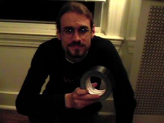
Boring Preface: Massachusetts state law requires a bike to have a forward light while riding at night. Commuting home on the city’s lit streets, I’m less worried about seeing the road than about other people seeing me. The cheapest bike lights seem to run about $20, so I’ll make that the maximum budget for this project. The light needs to be easy to attach and remove, durable enough to throw into a shoulder bag, and easy to turn on and off. I’d also like it to double as a flashlight the next time a transformer blows up in Central Square.

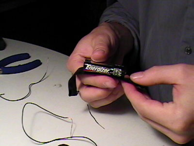
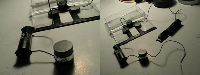
Theory: The front reflector seems to be the most logical place to attach the light to the bike, though I don’t want to obscure the reflector itself. It should be possible to build a bike light inside an old audiocassette case using two AA batteries, a pack of magnets, and a bright white LED upgrade for a mini Maglite. The light would clip around the bike’s front reflector. This project should cost less than $20.
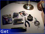
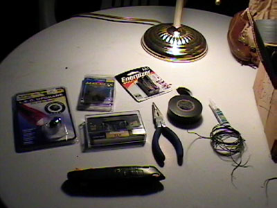
Get:

  • An audio tape case
  • A three-LED upgrade kit for a mini Maglite
  • Eight (8) round 3/4″ ceramic magnets
  • Two (2) AA batteries
  • Some thin insulated wire
  • A few scraps of aluminum foil
  • Electrical tape
  • A small tube of super glue
  • A pair of needle-nosed pliers
  • A utility knife
  • A ruler or measuring tape
  • Space to work

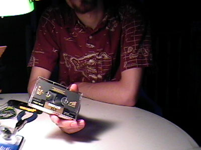
Make sure that the cassette case isn’t one of the newer “slim” cases, but the regular kind. The mini Maglite upgrade kits consist of a replacement reflector housing three bright white LEDs wired into a resistor correctly sized for two AA batteries. They retail for about $11. You could certainly use your own LEDs (I read that Christmas lights are a cheap way to get them) but I don’t know nearly enough of a damn about electricity to figure out what size resistor to use — just that I need one to keep from blowing the LEDs out. Three-quarter inch ceramic (black) magnets usually come in packs of eight at the hardware or hobby store, and go for about $1.25. They’re fun to play with. If you don’t have a little spool of insulated wire lying around the house, I guarantee you have a broken stereo in the basement you can pillage. Utility knives seem to have been renamed “box cutters” since I was a kid, but I refuse to let the terrorists win.

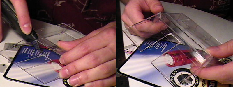
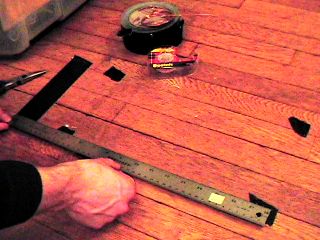
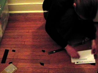
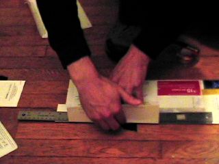
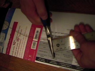
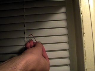
Step A: Measure the width of your front reflector. These instructions are written for a reflector about 2 and 1/8 inches wide. From what I can tell from a cursory look around Porter Square, this kind is fairly common. Some of the newer bikes have smaller reflectors (why?), which should work fine for our project. A larger reflector would require a larger case — maybe a VHS-C tape case. Everything jams in pretty snugly with this design as is, so if your reflector is a different size you’ll have to play jazz a bit.

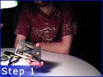
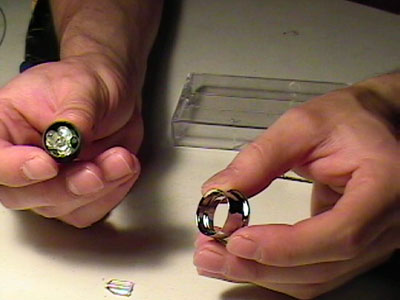
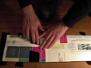
Step 1: Take the tape and label out of your audiocassette case and throw them away. Your crappy Sony deck hasn’t worked for most of a decade now anyway.

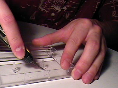
Step 2: Cut/snap the two prongs out of the tape case.

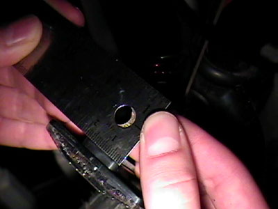
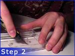
Step 3: Measure the width of the bracket on the back of your reflector — the part that connects it to the bike. Mine is 3/4 of an inch wide. The metal piece will probably be a little bit narrower than the part it screws into. If it is, just take the wider of the two measurements. Like I said, mine seems to be a pretty standard part, so if your reflector is the same size as mine it’s also probably 3/4 of an inch wide at the bracket too.

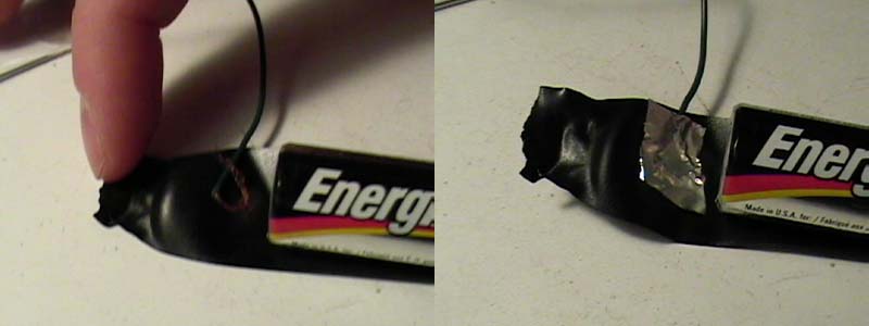
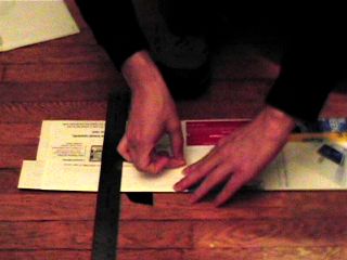
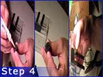
Step 4: Cut a notch, using that measurement, in the back of the tape case. The reflector and bracket together are too thick for the case to snap shut around, so we’ll need the bracket to hang out the back. Be careful to center your cut. Cut from the bottom of the case up to about even with the overhang. Mark your cut lightly with a straight edge or ruler, then go over it repeatedly until you cut all the way through. A little bit of splintering around the cut is normal, just don’t be so impatient that you crack the case. Did I mention it might be a good idea to put a new blade in your knife for this project? It might be a good idea to put a new blade in your knife for this project. Before now.

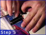
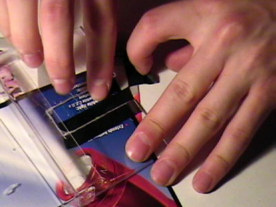
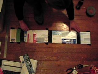
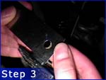
Step 5: Wrap electrical tape around all three sides of the cut. This will cover up the shattery bits, keep any cracks from spreading, and give it a nice rubberized mounting around the bike reflector bracket. Cut away the excess.

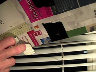
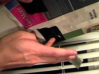
Step 6: Grab two of the ceramic magnets. We’re going to be gluing them on either side of the cut, about even with the overhang. These will be to rest against the back of the reflector, hopefully keeping it from moving too much. One by one — and with the other magnets clear — put a good bead of super glue on one of the two magnets, press it into place and hold it there for about a minute.

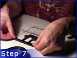
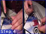
Step 7: Stick a piece of electrical tape along the entire length of the bottom of the case, folded over lengthwise. Half of it should be stuck to the outside of the case, and half to the inside, with the tape stuck to itself where it crosses the notch we cut. This will keep the bottom from wobbling by holding it tightly against the metal bracket. The electrical tape is a little bit stretchy, which is good. Anyone going for extra credit here might try sticking a rubber elastic inside the tape for extra holding power.

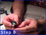
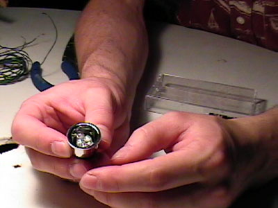
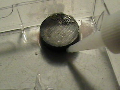
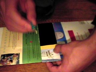
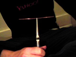
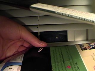
Step 8: Open the LED upgrade kit. You’ll find a little black cup with the LEDs inside and two wires sticking straight out the back, surrounded by a silver reflector.

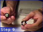
Step 9: Remove the reflector; the LEDs are bright and directional enough without it, and it’s too thick to fit inside our tape case.

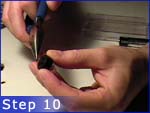
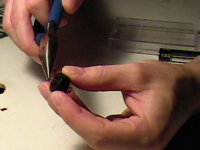
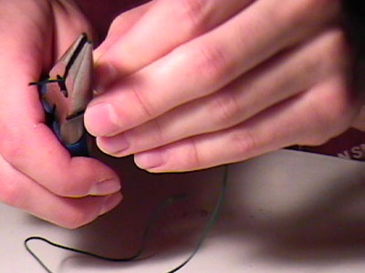
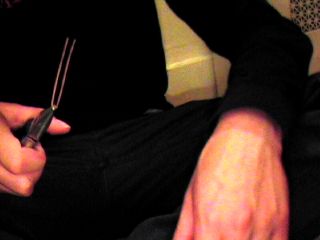
Step 10: Bend the two wires on the back to either side, being careful not to rush and snap them. I don’t really know how much abuse they’ll take, and I don’t want to find out.

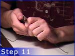
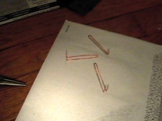
Step 11: Cut four pieces of wire: three long ones (maybe 4-5 inches apiece?) and one short one (1-2 inches long).

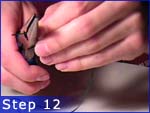
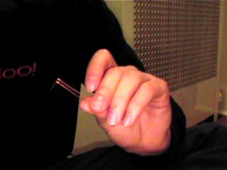
Step 12: Strip each of the wires half an inch in from both ends. If you’ve never stripped wires with pliers before, it’s easy: Go around the wire worrying the plastic insulation with your pliers’ cutters. Don’t squeeze hard enough to actually cut the wire. The plastic cuts more easily than the metal inside. Begin pulling the wire as you continue weakening the insulation. Look for strong places, and keep pulling the wire and worrying at the insulation. Eventually, the plastic will begin to slide off the wire. Yank it off, and give the wire a twist or two.

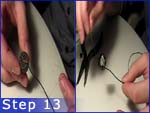
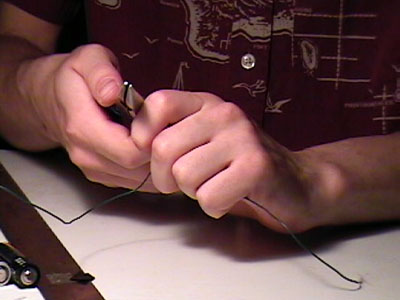
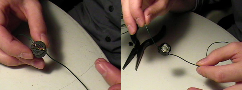
Step 13: Take two of your longer pieces of wire. Make a little loop in the stripped portion on one side. Slide this loop around one of the wires on the back of the LED cup. Twist it a few more times, and squish it all together to get a good electrical connection. Repeat, looping the second wire to the cup’s other connection. If you want now, you can solder the wires permanently together — but I hate soldering, and I don’t want to pretend this project requires it. Either way, finish by sticking a square of electrical tape on the back of the cup.

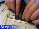
Step 14: Slide the LED cup up under the lip of the cassette case, facing outward. Feel free to glue it in place, but it’s a pretty tight fit — I say don’t bother.

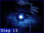
Step 15: Since LEDs only allow current to flow through them in one direction, we’ll need to figure out which side is + and which is -. Hold the wires against either end of one of the AA batteries. If it lights up (cool!) make a note of which side is which. If not, reverse and retry. (If nothing lights up, redo those connections.)

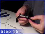
Step 16: Tear off two pieces of electrical tape, each about twice the length of a battery. Lay each strip of tape face up on the table and center the batteries on them. We’re going to be taping the wires directly to the batteries. It’s easy to do, and with the LEDs we won’t have to change the batteries much anyway.

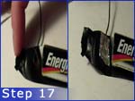
Step 17: Tear off two small scraps of aluminum foil. Stick the wire from one end of the LED cup to the electrical tape beneath the battery contact, and then put a scrap of foil on top of it. Wrap the tape around the battery contact. Repeat for the other wire and the other battery. Wrap the tape around the battery contact. The aluminum foil is here to give us a larger electrical contact. Aluminum foil is conductive.

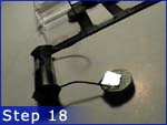
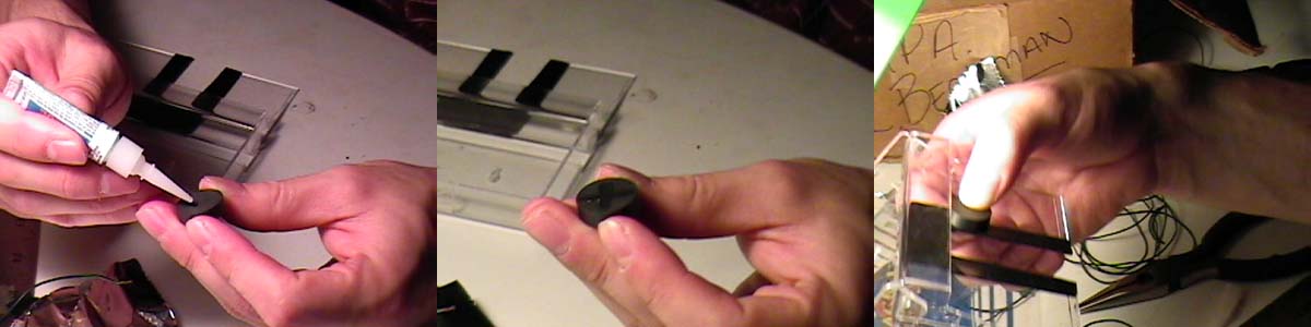
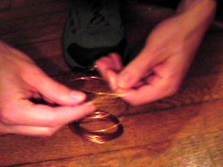
Step 18: Tear off two more scraps of aluminum foil. Using the same procedure as the last step, stick the short wire to the other end of one of the batteries. Grab a ceramic magnet and the other scrap of aluminum foil. Tape the loose end of the short wire to the top of the magnet, with part of the foil sticking out. Fold the foil over the top of the magnet.

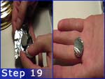
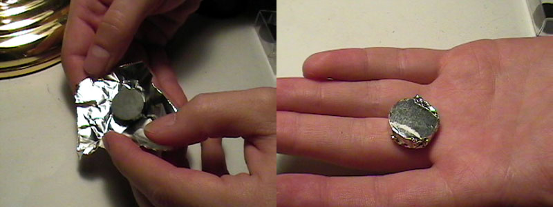
Step 19: Tear off a larger scrap of aluminum foil and wrap it completely around one of the remaining magnets. This will be our “switch.”

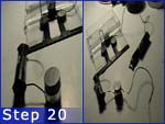
Step 20: As in step 18, tape the remaining long wire to another of the magnets, with a piece of foil folded over to make an electrical contact. Let it stick itself to the “switch” magnet.

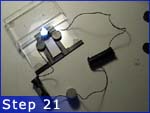
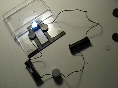
Step 21: Just like in step 17, connect the loose end of the wire to the remaining battery contact. The LED should light up. If it doesn’t, troubleshoot: We should have a circuit going from the LEDs to the first battery, through the bottom magnet, through the foil on the “switch,” through the second battery, back into the LEDs. Make sure your +’s and -‘s are all going in the right direction. Redo the foil/wire connections with more foil. If it did work, great job.

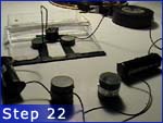
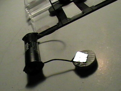
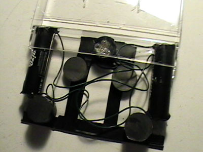
Step 22: Notice something. When you pull the “switch” magnet out of the stack and replace it with a bare magnet, the LEDs don’t light up. Ceramic magnets aren’t conductive. When the “switch” is in place, the circuit is on. When there’s a bare magnet there instead, it’s off. Leave the bare magnet in the stack between the two wired magnets. Stack the “switch” and the two remaining magnets with the “switch” in between. We should have two stacks of three magnets, which you’ll notice are about the same depth as the tape case.

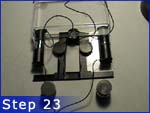
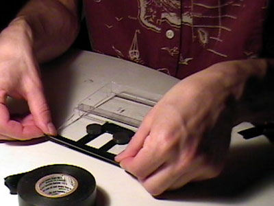
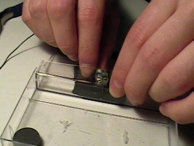
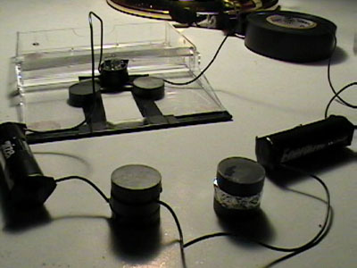
Step 23: Push the two batteries tightly into the top right and left hand corners of the tape case so that they’re square with the edge.

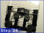
Step 24: Place the stacks of magnets at the lower inside corners of the batteries. Experiment with closing the tape case. Find the position where the stacks are as close to the lower right and left hand corners of the case as possible, but the case can still close without hitting the magnet stacks or the batteries. We want everything to fit snugly.

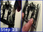
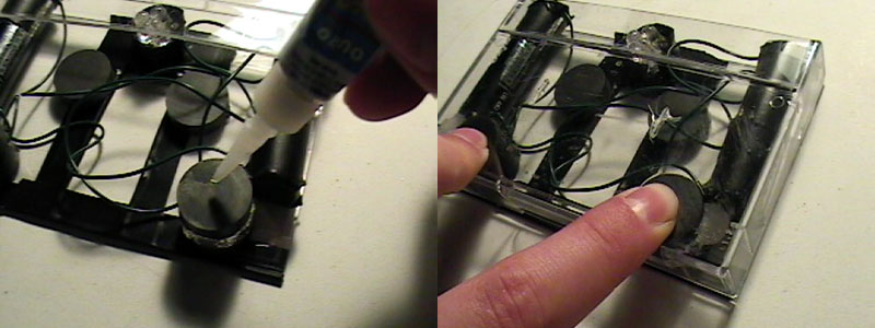
Step 25: Once you’ve found the ideal positions, put a generous bead of super glue on top of each magnet stack and close the case. Hold the case shut as tightly as possible for about a minute, to make sure the super glue sets up properly with the top of the case.

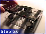
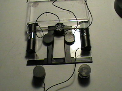
Step 26: Flip the case over and repeat step 25, gluing the bottom of the magnet stacks to the bottom of the case.

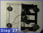
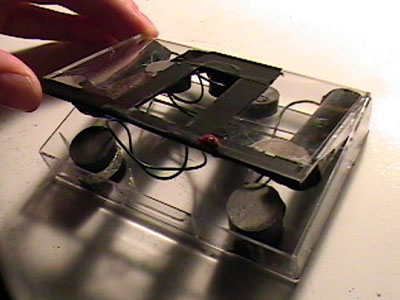
Step 27: Once you’ve given the super glue some time to set up, flip the case back over and reopen it. Since we had to cut that notch in the back of the case, the back is the weak point: pull evenly on both sides to reopen.

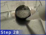
Step 28: The trouble with ceramic magnets is that they don’t like sticking to anything more than they like sticking to themselves. To add strength, encircle each of the glued magnets with another bead of super glue. Let it set up, and cut away the excess if it gets on anything else.

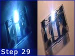
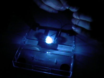
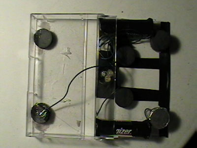
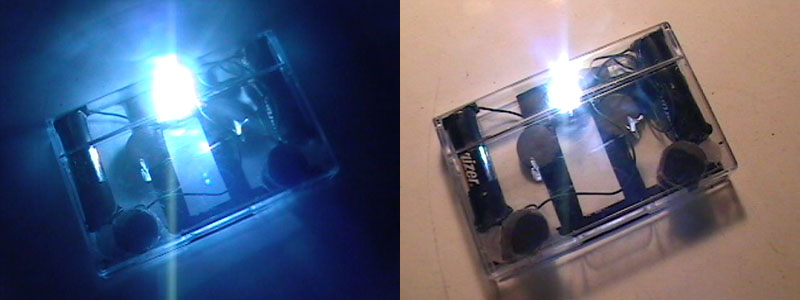
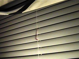
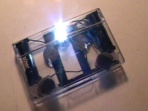
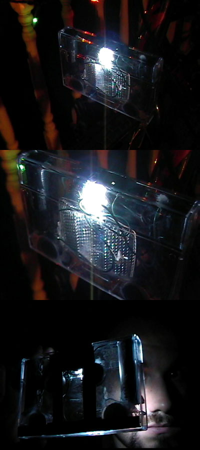
Step 29: Tape the loose wires out of the way. You’re done. Swap the “switch” with the other loose magnet (storing the loose magnet on the other stack) place it around your bike reflector and let it snap shut. You’ve got a light on your bike — a bright one at that, which doesn’t strobe, pops on and off easily, and won’t chew through batteries every couple weeks.

Criticisms: Despite being built in a plastic case, the light is far from waterproof. I wouldn’t even call it terribly splashproof. Silly as it would look, a sandwich bag over the top might not be the worst idea on a rainy day. Opening the light takes some learning, as you figure out how to evenly pull on both sides of the case’s back. The biggest problem I’ve encountered, though, is the one mentioned in step 28: ceramic magnets just don’t like to glue down. Step 28 was an afterthought, after I had to reglue one of the stacks. It’s certainly stronger with an additional bead running around the base of the magnets, but I’m starting to think a gel epoxy (nasty as that stuff is) might eventually be needed.

Final Thoughts: It works, weirdly enough. Assuming you already have things like pliers, electrical tape and a set of batteries, you should have no trouble beating the $20 budget. (If not, they’re good things to own.) Please enjoy your antiluxury good. Build one? Send me a picture.

If you liked this project, you may also dig the previous Build Notes: Junk Mail Blinds.

[Click here for a printable version — or just turn stylesheets off.]

SGV Artillery Game: Proof of Concept

Issue 173, for the week of 7/2/2006.

Toast Note: What with the site redesign (now complete), three concurrent jobs, and a bad summer cold, the Space Toast Page has been a bit neglected lately. Still, I have a treat for you this week. Thanks for waiting.

(If the above opens as plain text, save it to the desktop and drag the file onto your browser.)

This is a proof of concept for a tile-based artillery game using Scalable Vector Graphics (SVG) and JavaScript. SVG was meant to be an open, plugin-free alternative to Flash, but it was a relative failure. To date, only FireFox and Opera 9 fully support the SVG specifications, with Safari’s support still incomplete, and no native support in Internet Explorer. Adobe has released an SVG viewer plugin for most web browsers, but Adobe’s implementation is not fully compatible with standard SVG. Still, the Safari development team is making fast progress, and Google is reported to be working on a translator for Internet Explorer, so SVG may yet see a true dawn.

To date, the game has only been tested in FireFox 1.5 for Mac and Safari 2.0.4. It is buggy, but runs in FireFox. Safari will draw the initial game state, but does not loop.

The game runs at a resolution of 700×500 pixels. In a window smaller than that, FireFox creates scrollbars, which trap the arrow keys. I don’t know a way around this yet. It should be possible to make the game scale up or down to the size of the window automatically, as SVG is resolution-independent, but that may require redoing the artwork and JavaScript to use percentage measurements, rather than pixel measurements.

The game artwork was created in Inkscape, an open-source project which is making great strides toward creating an alternative to Adobe Illustrator. As of version 0.44, Inkscape is not suitable for directly editing graphics in an interactive SVG file. It has a tendency both to mangle JavaScript and to revert custom group names to generic ones. Additionally, Inkscape’s method of saving object attributes like color and stroke width is to bundle them into one long style element (i.e. style="fill:#574736;fill-opacity:1stroke-width:0;stroke-opacity:1") rather than splitting them into individual elements, which are easier to access with JavaScript. The Inkscape team’s progress remains impressive.

My biggest concern is speed. The game currently maintains its frame rate by idling for 10 milliseconds between loops, although I think I’ve come up with a better way to do it — please refer to the JavaScript’s comments. Although I doubt that FireFox’s SVG drawing routines are tuned for game speeds, my biggest worry is the speed of JavaScript execution. Some parts of the script store game data in JavaScript variables, others assign it to the game’s SVG objects — as whim desired, really. The latter seems to be considered more “correct,” in terms of modern programmers’ fetish for object-based programming, but I’m all but convinced it’s terminally slower than the former. Accessing elements (manipulating the DOM) is also an absolute pain in the ass in JavaScript. For both reasons, I suggest doing it as little as possible.

As near as I can tell, this is the most advanced SVG game anyone has written to date — which is sad, but telling. Owing to uneven support, sluggish speed and lack of an integrated development environment, I can’t see SVG supplanting Flash any time soon. Still, SVG is not without potential. Enjoy the game.

Further Reading:

With some previous JavaScript experience, it took me about a week of spare time to get this far. The following sources and examples were invaluable.

Clip Splicing Without QuickTime Pro

Issue 170, for the week of 4/30/2006.

QuickTime Pro wouldn’t have pissed me off if they hadn’t taken features out of the player to make a paid version. Add some good stuff, charge me extra for it and keep the basics free — fine — but cripple the software and charge me extortion money, and I’m not inclined to pay. I’ve been using Macintosh computers for a long time; I remember when it was exciting that a clip could actually maintain synch! I remember QuickTime 1, QuickTime 2, and the Waterloo that was QuickTime 3. Release three was when Apple gave us some nice codecs and tried to dance around the fact that they’d started charging for cut, copy and paste. It was also when they began nagging us to upgrade to Pro, but that, fortunately, has taken a more subdued tone lately.

Since I never use the second paragraph of a Space Toast Page to actually set up the essay, let’s just take a second to mention that it’s Apple’s botched QuickTime strategy that has gotten us to 2006 with no serious alternative to Flash. Full JavaScript-based interactivity, on-the-fly transitions, realtime filters, and unlimited dynamic tracks in any supported video, still, audio, 3D, panorama or sprite format were and remain possible in QuickTime, but without a real track-based development tool (which should have come standard with every Mac) these features remain hollow bullet points.

Never mind that you can’t cut, copy and paste anymore.

So what are our options? Let’s say, theoretically, that you’re working on an animation for a local science museum. Theoretically, they’re going to be running a QuickTime movie to a video projector from within a PowerPoint presentation. Imagine that it’s about Ben Franklin, and it’s going to be fantastic. This is all theoretical, mind you. Now lets imagine that, because it’s going to a video projector, you’re working at above DV resolution. You nursed Premier along for far too long, and when Apple did a trade-over promotion with Final Cut DV you jumped at it. Here’s the problem: Any editing, even splicing clips together or adding a sound track, will cause Final Cut Express (another creatively crippled program) to first scale down to DV resolution (720×480) and then scale back up when you export — resulting in a noticeable loss of image quality, especially on the kite strings. (Don’t forget how theoretical this all is.) All you really need is the 21st century equivalent of a Steinbeck, but QuickTime paywalled clip splicing in 1998.

The solution is to go back before 1998. QuickTime 2.5 was the final pre-3.0 release and, being freeware, installers can still be found all over the internet. Download a QuickTime 2.5 installer, choose Custom Install, and install only the MoviePlayer application. At the risk of talking out of my ass, at 164k, the MoviePlayer application seems to be little more than a pass-through for features wired into QuickTime, which means that MoviePlayer can now do more than it could when it came out. For instance, it can play .dv clips, or .mov clips compressed with the DV codec, even though digital camcorder support wasn’t added to QuickTime until 3.0.

MoviePlayer can’t do everything though. H.264 (one of what appear to be three different implementations of MPEG-4 video currently in QuickTime) runs only under Mac OS-X, and opening one of its clips in MoviePlayer will return an error — thought, impressively, not a crash. “Present Movie” will crash Classic however; don’t use it. As a Classic application, MoviePlayer is limited to QuickTime Classic’s codecs: Animation, BMP, Cinepak, Component Video, DV NTSC, DV PAL, DVC Pro PAL, Graphics, H.261, H.263, Intel Indeo Video 5, Motion JPEG-A, Motion JPEG-B, MPEG-4 Video, none, Photo – JPEG, Planar RGB, PNG, Sorenson Video, Sorenson Video 3, TGA, TIFF, and Video.

MoviePlayer has the old-fashioned design philosophy of a product without a marketing strategy. It’s remarkably intuitive by today’s standards. Drag on the timeline with the shift key to select part or all of a clip; a black bar appears to indicate how much you’ve selected. You can cut, copy, paste, delete, or drag and drop to your heart’s content. (Large clips sometimes return low memory errors with cut, copy and paste — dragging and dropping seems to avoid this problem entirely.) “Extract Tracks…”, in the Edit menu, creates a new clip with either the audio or video track. Tracks may be deleted individually, or temporarily turned off and on in the Edit menu as well. Choosing “Get Info” under the Movie menu and selecting “Time” from the “Files” popup menu will allow you to view timecodes.

To get back to that theoretical Ben Franklin animation, pretend that you have spliced together a final cut of the animation and need to replace the scratch track of the live actor’s lines with a sound effects track mixed in Audacity or Final Cut Express. Open the sound clip you’ve exported from either program, select it all and copy it. Go back to the animation clip, choose “Delete Tracks…”, delete the current sound track, and click on the first frame of the clip. Hold down option and go up to the Edit menu. The “Paste” menu item has become “Add,” which will allow you to paste the sound track under the video. Selecting “Paste” without holding down the option key will perform the default insert operation, moving all the video out of the way and inserting black video for the length of the audio clip. It’s weird, but it makes a kind of dumb sense.

We have successfully edited a QuickTime clip, and we have two options with which to save it.

The File menu’s familiar “Save As…” includes two choices of its own. “Save normally (allowing dependancies)” will display a much smaller file size than “Make movie self-contained.” Chances are the latter is your best bet though. “Make movie self-contained” will copy all of the track data you’ve added to the clip into one file, rather than looking up all of the individual files you spliced together to make the clip. When you select “Make movie self-contained” a new option will ungrey: “Playable on non-Apple computers.” Select this. QuickTime used to default to saving movie data into a “MooV” resource alongside the data fork, rather than into the data fork itself; non-Apple systems never used the split resource/data fork file structure, and see only an empty or corrupt movie file. Use the “Playable on non-Apple computers” option to avoid this problem. The advantage of “Save As…” with “Make movie self-contained” and “Playable on non-Apple computers” is that the resultant movie will be exactly the data that you fed into it. Nothing is recompressed. There is no digital generation loss (and yes, there is such a thing).

What if you need to recompress the movie though? Suppose you need a 320×240 version compressed for the web. What if the computer playing the animation has too slow a hard drive to keep up with the Photo-JPEG codec at maximum quality? Beneath “Save As…” is an “Export…” option. This brings up the standard QuickTime export dialogue, from which you can export to non-QuickTime formats, as well as change the frame size, frame rate, sound and video codecs, and streaming optimizations.

As usual, I’ve gone on for far too long with a very simple idea, and one week’s Space Toast Page has become another’s. If you can run Classic, get MoviePlayer. It’s a pawn shop Swiss army knife with a rusty corkscrew and the initials P.B.R. carved into the handle, but it still basically works. If you want a Big Message, which I’m sure you don’t, onward is not always upward, and Neil Young can kick it out better in nine days than John Melencamp could in his entire wasted career. Thank you for reading.

DVCam High Resolution Photography

Issue 167, for the week of 3/5/2006.

“Copley Square at Night” 1415 x 2559 pixels. 890KB jpeg.

The picture above was stitched together from 108 smaller images using Hugin, a set of open source panorama creation tools. Each slice was captured to tape on a consumer digital camcorder by slowly moving the camera back and forth across the scene from top to bottom at full optical zoom. Once imported and converted to a series of tiffs, the autopano-sift module was run to automatically match neighboring images. Matching points were input by hand in places where the software could not do so. The combined image was exported at full resolution with the edge-smoothing “enblend” module enabled. Cropping and sky completion were performed in Photoshop, and the image shrunk by 50% to eliminate jaggies left over from the camera’s original compression.

A Random English-Sounding Place Name Generator

Issue 166, for the week of 2/26/2006.

Here is a funny request:

I'm launching my new Feudalism inspired game next week, and I need a TON of english

sounding region names. Like Woodstown, or Clapshire.

I can TRY to think of them all myself (I'll need anywhere from 45-50), but the

prospect baffles my widdle mind. SO if you have time and inspiration, and feel like

inventing 4-5 of them FOR me, I'd really appreciate it.

Thanks (in advance)

-EvilMustache

Below are fifteen randomly generated English-sounding place names. Reload the page for fifteen more. Enable JavaScript if nothing appears:

Myst V and the Way Forward

Issue 165, for the week of 2/19/2006.

Literally three steps in, I’m defeated by a low gate. I’m looking down at it. I could step over it. Still I’m trapped.

I have chosen to begin this essay with a digression.

You know those programs that change the screen resolution when they go to full-screen, and then tell the other applications that they’ve done it? It’s a kind of a slapdash Mac port thing. You quit, and every window on the screen has been squished down to an absurdly wee size and moved to the top left corner of the screen. Myst V is like that.

Ultimately, that’s not the point of this essay, though.

As with Myst [I], the exploded box of which hangs on my wall for inspiration and which I can still play under Classic, the default navigation system of Myst V becomes bothersome after a few minutes. You’re rarely quite looking where you want to be, and yet with the Obsidian/Burn:Cycle-style smoothly eased tracking shots between nodes replacing Myst’s hard cuts and simple transitions, you often find yourself looking at the interesting object during movement, only to have your camera jerked away from it as the move completes. Nodes that would appear to give access to nearby areas are often a few feet from the ones that actually do. Myst V, of course, adds two additional movement styles, a free movement mode that doesn’t appear to support game pads, and a “Classic Plus” which slaves the view rotation to the mouse cursor — something not to be attempted without a truly boss frame rate and/or a love of vertigo.

Still, we haven’t reached our ultimate point.

The engine underlying Myst V is unique to the in-storyline Myst franchise. Instead of prerendered stills (Myst, Riven) or prerendered VR panoramas (Myst III, Myst IV), the game is rendered in realtime 3D. The appeal of this method for the developers is obvious. Rather than setting up shots, rendering, tweaking, rerendering, overlaying animations, and then having to move to a wholly separate software system to construct the game play, development goes straight from modeling to game engine in one step, assisted by a glut of available off the shelf software. Besides that, it just feels more modern — an unremarked upon motivation among middle-aged tech developers like the Miller brothers.

The trouble is, it’s not better. Compare the following screen shots:

Even with the best video card, which you don’t have, and all the light baking and optimization tricks in the book, the graphical quality of a frame rendered in one 30th of a second is never going to achieve the richness of a frame rendered over half an hour. The underlying models and textures must be smaller. The lighting system must be simpler. Even with a compressed color palette and knife-sharp shadows (not entirely undesirable for direct sunlight), not to mention eight years between them, the Riven screenshot is more realistic than that of Myst V. The objects are more complex and more numerous, the textures are high enough quality to be invisible, and everything that should cast a shadow does.

Of course, the quality of a still image isn’t the end of realism, which is where we uncover one of the most compelling reasons for the move to realtime 3D: Myst V moves. Look at the water in the game’s reversed wood between the worlds starting point, and even on low texture quality you’ll see ripples. Moving ripples. No more strange, frozen glass oceans. Stand still when you arrive on the beach. The clouds move slowly through the sky. The waves roll in and fall away. Birds flit through the sky (though most seem to be part of the static landscape). The sense of immersion is heightened, until, of course, you start wishing your video card could smooth those jaggies without the frame rate tanking, you notice that the smoothness of objects’ faces becomes angular at their edges, and you’re just plain stopped while floating along like Professor Xavier by a tumble of small, ordinarily fun to climb rocks.

It’s still not our point, but it’s worth mentioning that it’s best to make an insurmountable obstacle insurmountable. Personally, I can also climb a ladder with one hand, wade, and swim — not that it matters.

We do in fact have a point, and we’re getting dangerously close to it.

Myst V, while perhaps as good a puzzle game as its predecessors, has abandoned its roots. This, in itself, would not be a bad thing if the result were actually worth the change.

Let’s review what Myst V has gained:

  • Unlimited panning. Can also be achieved in prerendered graphics using VR panoramas, as with Obsidian, Myst III, Myst IV.
  • Animated tracking shots between nodes. Unnecessary. Our brains understand a “cut” — it’s that blink we do every time we look from one object to another. The novelty wears off quickly, as game play is slowed by it.
  • Free movement. Draws attention to the character’s limitations. Movement is still on a rail, we’re simply allowed to deviate slightly from it. Not essential to this genre.
  • Dynamic lighting effects. Underutilized. Aside from the hard shadows cast by moving objects, most of Myst V’s lighting appears to be painted on.
  • Hardware acceleration. Modern video cards can do a lot.

Now let’s review what Myst V has lost:

  • Prerendered graphics. Visually superior to realtime 3D graphics in richness and complexity.
  • Video. Those motion-captured 3D people with actors’ faces look pretty creepy, and the cloth keeps intersecting the legs.

Myst V is the last Myst game, but it need not be the death knell of the genre. There is room to move forward with the graphical adventure, while learning from the mistakes of Myst V. Realtime 3D graphics simply aren’t good enough. Is there a better way? I would suggest that there is.

First, though, review this QuickTime VR panorama of a node in Myst V. The panning doesn’t quite feel right. I suspect that there are two reasons for this, one trivial and the other quite complex.

Regarding the simpler problem, real life lenses are rarely perfectly round. They tend to flatten in the middle, creating lower distortion near the center of the image and higher distortion toward the edges. We’ve come to expect this. VR panoramas, which typically distort and display a portion of a single 360 degree image, are, I suspect, correcting for an idealized lens. Distortion is lowest at the center and increases toward the edges at a rate that is mathematically “right,” but less complex than that of a typical lens. If I’m right, this should be easy enough to overcome by tweaking the lens correction algorithms.

The second problem is more complex, and it has to do with the way cameras are actually manipulated. Photographing panoramas requires the purchase or construction of a custom camera mount which places the lens directly in the center of rotation. This is unusual. Usually, the camera is mounted at its base, placing the lens above and in front of its center of rotation. Panning thus introduces a small movement to the camera’s view position in addition to its orientation. Your eyes are likewise mounted above and in front of their center of rotation. The effect is most noticeable when objects are close-up. Close one eye and hold a pen up in front of you. Turn your head left and right. You can see different things behind the pen based on where your head is turned. You expect to. It’s part of your sense of depth, and it’s something that VR panoramas completely fail to reproduce.

Here we have arrived at our point.

I propose that a slightly novel game engine can overcome the limitations of both VR panoramas and realtime 3D in the graphical adventure genre. We can regain the detail of prerendered scenery and filmed actors without sacrificing the ability to animate portions or all of a given scene. If we accept the primacy of the node to the genre, discarding arguably unnecessary tracking shot transitions and “free” movement modes, we can consider a new style of node construction I unceremoniously dub the Dented Ball.

The Dented Ball is a real ball, or rather a very close approximation made up of several hundred triangles. Inside it lies a virtual camera, slightly above and forward of center. On the inside of the ball is mapped a high resolution image of a prerendered scene. Looking outward, the virtual camera records a portion of the scene, corrects for lens effects, and sends the resultant view to the player. This ball is our basic game node.

The scenery images, not to mention the tiny amount of data needed to construct this particular ball’s geometry, are loaded from the game DVD while the player is at a nearby node. Priority is given to the nodes directly connected to the previously occupied node, with priority further given to those portions of the landscape that the player would see first upon stepping into a given node from the previous. Nodes far behind are discarded, and reloaded only when the player nears them again. The goal is to minimize or eliminate waiting time between nodes.

Animation such as waves, birds, and even people may be added to the scene by mapping movie clips, rather than still images, to a portion or all of the inside of the Dented Ball. Modern video compression algorithms nearly half the amount of data that must be pulled off the game DVD to equal the image quality of a standard movie DVD, and modern computer DVD drives are capable of reading data much faster than is necessary to play movies compressed the old fashioned way. By feeding movie clips into the priority system above, waiting time between nodes can still be kept to a minimum. In addition, a standardized set of tools for fading, overlaying and cutting between still images should be integrated to allow for such simple effects as lightning flashes and the slow dimming of the sun as it goes behind a cloud, without requiring a large and unwieldy video clip.

In an ideal scene, there are no objects near the camera. (This is of course unlikely.) The edges of the ball on which the scene is painted are too far away from the viewer for the slight position offset of the camera to be noticeable. This would be a scene of the player floating high in the air — on the whole not very useful.

Nearby objects are the reason we call this the Dented Ball. Imagine that the player is standing near the corner of a wall. Panning right, more of the right side of the wall becomes visible, panning left, the opposite. In order to simulate this effect, the ball itself has been dented inward, toward the camera, so that its edge matches up with the wall’s corner in the prerendered scene. From the outside, the ball would appear to have a large dent in it, hence our name for it. Because the camera offset is most noticeable when objects are close, gradually falling off to imperceptibility as objects move farther away, the actual dent of a perfectly right-angled wall in the ball would not have straight edges, but would in fact taper out at an increasingly gentle angle before plunging smoothly back into the outside surface of the ball.

Despite our name though, dents aren’t the only method we’ll need to produce proper foreground/background separation while panning. (We should just go ahead and call this separation “parallax effects.”) Reference the pen with one eye closed again. It, like a blade of grass, glasses on a nearby table, and any number of other real world objects exhibit a complete separation from their background. In such cases we’ll need to slice the ball into concentric layers, like an onion, and map a series of cutout portions of the scene onto each. There will be times when we’ll need to combine slices with dents. Depth maps, grayscale images representing simply how far any point in a given image is from the camera, can be rendered from any 3D animation package, and can be used to assist an automated workflow for making these dent and layering decisions.

The Dented Ball allows us to create a richer visual experience, both static and in motion, than any previously conceived graphic adventure engine. By repurposing modern video cards to draw concentric near-3D nodes, we find a new way to leverage the technologies users and game developers already possess. We unify the rich legacy of graphic adventure games like Myst V while discarding our detrimental modern preoccupations. In doing so, we glimpse a third path though the complexities of contemporary game design and begin once again simply to explore.

Build Notes: Junk Mail Blinds

Issue 160, for the week of 12/4/2005.

Boring Preface: There’s this idea of “junk chic” floating around that I’m vaguely attracted to. Most of it, however, seems to be concerned with buying old crap at antiques stores and putting a new coat of paint on it. What I’m interested in is more finding uses for the reasonably well-made things we’re expected to throw away. Somehow I’m not sure if making things yourself will ever come back into the mainstream; there’s just too much money to be made selling us everything. Maybe that’s the point. Free software, free instructions, free knowledge… There’s a growing, silent acknowledgment that there needs to be a non-commercial sphere to life, distinct from religion and opposition, and this nebulous idea of “family” our politicians keep pounding us with. Not everything is about money. The irony is that the people who sent me the raw material for this project did so in the hope of making money from me. And they can screw.

Theory: By affixing strips of junk mail to an existing set of venetian blinds, one can drastically reduce the amount of light allowed through without losing the ability to raise and lower the blinds.

Get: In my case, about three months’ worth of junk mail, but your mileage will vary. Your trusty roll of duct tape (color to suit). Two rolls of scotch tape. A ruler. A spool of uninsulated wire. A pair of needle-nosed pliers. A thumbtack. Space to work.

Step i: Measure the width of your window. The real width. Don’t leave a full inch on either side like those goddamn blinds we’re covering over. Leave maybe a couple of millimeters. (Dark! We must have dark!)

Step ii: Tape off on your workspace a piece of real estate (in my case, floor) measuring the same width as your window and six inches tall. (Or three floorboards, if they’re each two inches tall.) This will serve as a template for building the sections.

Step iii: Next we’ll need to figure out where to affix the hangers that will connect the junk mail blinds to the existing ones. We will eventually be bending wire into a set of three connector pieces, one for each of the three strings running down through the original blinds. For now, grab your ruler and measure the distance between the edge of the window and the nearest of these strings. On your template, go in the measured distance from either side and make tape marks. Also, find the center of the template and mark it with tape as well. I think we’re ready to start building a section.

Step 1: Find a nice piece of junk mail (you’ll start talking like this) — maybe a credit card letter with your name misspelled, or a useless “newsletter” from your predatory health insurance company. Lane Bryant sure likes sending me fliers now that they’ve decided I’m female. Whatever you have handy.

Step 2: Fold the piece of junk mail upward at the bottom (I recommend using an existing fold) and align it with the bottom left corner of your workspace.

Step 3: Tape the folded portion down with scotch tape.

Step 4: Fold the top of your sheet of junk mail down so that it fits within your six-inch template. Chances are it doesn’t have another crease already made at the six inch mark, so use your ruler to make the fold yourself.

Step 5: Tape that bad boy down.

Step 6: Grab another piece of junk mail. Place it under the previous piece so that they’re overlapping by an inch or two.

Step 7: Fold the bottom up so that it’s sort of “eating” the previous piece.

Step 8: Tape the folded part to the old piece and to itself. Be sure that the corners are taped thoroughly.

Annoying Tip: Kinda thin? Not sure it’s going to block enough light? I’m sure you’ve got a lot of little pieces of junk mail floating around. Why not tape one of them inside the fold before taping it down? Envelopes work great for this — they’re two-ply. You can even stick smaller annoying things like fake credit cards inside the envelopes before taping them down.

Step 9: Grab your ruler again and fold the top down.

Step 10: Tape that muthah down, and to the previous piece.

Step 11: Repeat steps 6 through 10 until the section fills your template. You now have a strip of junk mail six inches tall, and as wide as your window.

Step 12: Enjoy a good pull of Endurance Ale. You’ve earned it! (It’s called Endurance for a reason, but it grows on you.)

Step 13: Flip the section over. You’ll notice that all the taping has been done on the reverse, keeping it out of sight. Just because we’re making things out of junk mail doesn’t mean we can’t pay attention to aesthetics.

Step 14: Grab your duct tape. We’ll be using the duct tape to add strength where the new blinds connect to the old ones. It’ll also impose some kind of order on the appearance of the blinds, which is probably just as well.

Step 15: Rip off a strip between half again and twice the height of the section. That’ll be about ten inches, if you want to measure it.

Step 16: Use the marks you made in step iii to stick the tape down where it will be needed to match up with the string.

Step 17: Flip the section back over.

Step 18: Fold the ends of the strip of duct tape over and stick them down. Remember, we don’t care too much what this side looks like.

Step 19: Repeat steps 13 through 18, placing a strip of duct tape for each of the three marks we made in step iii.

Step 20: Grab your thumbtack. On each of the strips of duct tape, make two holes about a quarter of an inch apart and one inch from the top of the section. I recommend cutting out a template, to save you from having to measure the position of the holes every time. Make sure the holes go all the way through, and are wide enough to get a piece of wire through. Don’t stab yourself.

Step 21: Grab your spool of wire. Straighten a bit of it out to work with.

Step 22: Using your ruler and pliers, snip off three pieces of wire each measuring four inches long.

Step 23: Center a piece of wire in your pliers.

Step 24: Fold it in half, into a long horseshoe shape.

Step 25: Fold the wire at a right angle, half an inch from the pronged end.

Step 26: Repeat steps 23 through 25 for the other two pieces of wire.

Step 27: Twist your venetian blinds shut so that the slats are angled down toward you.

Step 28: Insert the first of the bent pieces of wire around the first string on the inside of your blinds. We want it to hang so that the prongs are facing inward.

Step 29: Repeat step 28 for the other two pieces of wire.

Step 30: Bring the blind section over to your window and find the first set of holes in the top of the duct tape.

Step 31: Place the first prong through the first hole.

Step 32: Place the second prong through the second hole.

Step 33: Reach around behind the section and bend the prongs up, flush with the back of it.

Step 34: Repeat steps 31 through 33 for the other two pieces of wire. The new junk mail blind section is officially hung.

Step 35: Tear off three small squares of duct tape.

Step 36: Stick each over one of the exposed sets of prongs on the back. This is to keep the ends of the wire from catching on anything. Squeeze tight.

Step 37: Repeat all numbered steps until the blinds are complete.

Criticisms: I’ve noticed two things, since completing the blinds, which deserve attention. First, the mechanism in the blinds, not being designed to hold this much weight, has begun to squeak a bit. A dab of electric shaver oil or graphite would probably take care of the problem, but I haven’t bothered to try yet. The second concern is a tendency I’ve noticed for the lowermost sections to catch momentarily while nearing the bottom. Why this should be an issue near the bottom but not the top I still don’t know. I’ve found that the problem can be reduced by bending the wire hangers outward on the bottom-most sections, so that the blind section sits farther out from the original slats.

Final Thoughts: It took me about twenty minutes to do a section, once I got all of the experimenting out of the way. I did one or two sections a night, which made for some relaxing non-computer work before bed. (It was kinda nice.) I’m still not totally satisfied with the hanging scheme (bent wire) but I haven’t come up with anything better or easier. All things considered, I’m pretty happy.

Junk Mail Art

Issue 159, for the week of 11/27/2005.

Toast Note: Failing to produce a real Space Toast Page tonight, I got playing with junk mail a little after midnight (it’s now close to 3AM). The medium represents an inexhaustible resource, and I’ve been endeavoring to come up with uses for it lately. The following pieces are assembled out of what junk mail I’ve accumulated since the blinds project. (More on that later.)

Lem’s Bunny, from the web comic of the same name. It’s been submitted in a slightly different form to Bunny’s Warren, the section for fan-made strips.

The Marboxian. It had to be done.

Finally, Berkley Breathed’s Opus, who in my world needs neither introduction nor invitation.

Notes on Admiral Bulletin and the Internet Elucidation

Part I: The Origins of the Admiral

First Note– In 1962, when it looked like no more Bulletin books would be written, Judd Harkins retired the characters with an engagement and an indicated Eppings on High Street wedding. When the Cerf Publishing Group relaunched Bulletin the following year, the betrothal was explained away and disposed of. (The “engagement” scene in empty Paddington Station had been staged for the eyes of the villain, although fans have pointed out some logical inconsistencies with the notion.) In Bulletin’s aired appearance on the Saturday morning cartoon series Defenders of the Earth (Episode 121, “The Lost Ship”), Bulletin was depicted raising a son with Miranda on a farm they’d improvised in the lost recesses of the Congo basin. Like fans of the other King Features Syndicate characters used in the show (Flash Gordon, The Phantom, Mandrake the Magician, et al) few Bulletin fans regard the episode as canonical.

Second Note– The original lines, as written by Peter Stepford (Admiral Bulletin and the Turning Sea, First Edition, 1932. Page 214):

“There’s no time left!”

“I said bring her hard a-port!” the Admiral shouted.

“Into the minefield? Are you mad? There isn’t berth.”

“There must be!”

Part II: The Golden Age

First Note– MacRae, Jodi (Judith Mankiewicz) “Backstage at the Bulletin”, The Observer, Feb 12, 1993. Packard’s trial records refer to his mother’s house on Wentworth Street in East London. This meshes with the address given by Packard in his contract with Glencannon Press.

Second Note– The number is somewhere between 289 and 314. If you have your own copy and want to count it, page by page, please… be my guest.

Third Note– There is some debate about when exactly the Golden Age ends. Bulletin’s hiatus from novels between 1939 and 1941 is often considered its logical end. Many fans, myself included, believe that the daily strip storylines continued the best Golden Age traditions well into the 1950s, but I disagree in asserting that this makes them true Golden Age works. (Though I have some affinity for the “Silver Age” nomenclature. Don’t send letters though; I’m not going to use it in the essay.)

Part III: Admiral Bulletin and the Daily Strip

First Note– Hartley illustrated trades of Stevenson’s Treasure Island, Dumas’ The Count of Monte Cristo, Wells’ The War of the Worlds, Verne’s Five Weeks in a Balloon, and probably one or two others. I’ve seen a few scans of his early work, and while its not on par with the Brandywine school artists, or even Hartley’s own later Bulletin strips, it’s worth a look.

Second Note– Hartley’s tradition endured with such remarkable force that when in 1967 Marvel comics based a major plot point of revealing Miranda’s face (“Admiral Bulletin #32”) public outrage in Europe was so intense that the authors were forced to backpedal with a plotline involving a double. The later Image comic would not make the same mistake.

Third Note– Personally, I think he was trying to cover his butt. I have trouble believing that Hartley’s flair for intrigue didn’t spring from a fair dose of real-life paranoia, and Glencannon Press’s management wasn’t always one to honor its agreements.

Fourth Note– Increasingly off his leash, toward the end of his Bulletin’s run, Stackpole’s artwork began to slide into very baroque territory. Fantagraphics (who is doing an amazing job with Peanuts) is planning to release the Bulletin Strips beginning in 2007. These will be full hardcover editions, unedited, and otherwise just about everything the old ’70s trades weren’t. I haven’t figured out if Fantagraphics has the “lost” Stackpole strips, but I’m keeping my fingers painfully crossed.

Part IV: The Turbulent Years After/Colophon

First Note– I’m basing this on Silvestri’s introductory essay in issue #1. He seems to have known Bulletin by the ’70s collection of daily strips. I’m not really sure how old Silvestri is, but I’m guessing he wouldn’t remember the strip when it first ran, and he doesn’t mention the books in his intro.

Second Note– Marvel didn’t have the rights to the A. C. Vellum pseudonym, and it was not used on the Admiral Bulletin comic book series.

Third Note– I hadn’t really found a better place to put this, but a biographical sketch of Robespierre by Nigel Hartley is known to exist. It’s been floating around with fans for years. This comes courtesy of Troy Minkowsky, OfTheAtomic:

“The Tragic Tale of Robespierre”

Robespierre Cholmondeley was born in Vezelay France, the only son of a watchmaker. At three years of age Robespierre started showing inhuman skills, such as transformation and being able to read the future. He was discouraged by his deeply Catholic parents to display his talents and suppressed them. It was not until he turned sixteen when Robespierre used his powers to save his girlfriend from a burning building. This caught the eye of the French Government. 

At age seventeen Robespierre earned special agent status in the French government. He dealt with threats to France an of occult nature. A significant tool for many years, his loyalty came into question when word of his involvement with the French Communist party leaked out. The accusation was only a half truth, for it was RobespierreÕs girlfriend who was the Marxist. While no longer trusted, yet still a valuable tool, the French Government recommended him to a special tasked force formed by the Brits. The head of this taskforce was one Admiral Bulletin. 

The two soon became quick friends. Both where child prodigies, Robespeirre a high Shaman at age twenty-three and Bulletin commanding his own fleet at twenty-six. The two had a great love of sport, cinema, and the ladies. The only time the two argued was over chess and women. 

Their first mission together was a voyage to the deep heart of the Congo. A British trading post was attacked by a Snake Goddess and it was up to them to restore order. Foolhardy with a sense of invincibility that could be blamed on youth, the two rushed in. 

The Admiral lost thirty men when the fleet was attacked by giant Congo-Serpents . Robespierre was held captive by the Snake Goddess for two months before Admiral Bulletin was able to set him free. With what was left of his strength Robespierre was able to banish the Serpent Goddess into another dimension, but not without a price. His head started to fall apart, chipping away, and the chaos magic inside him began to spill out. No longer alive, yet not quite dead, he existed in Limbo. 

He fled to Tibet, wishing to spend the rest of his existence in solitude, but it was not to be. For his good friend Bulletin was organizing a group of people with extraordinary powers to save the world, a mission Robespierre could not resist.

Still More Human Resources

Issue 158, for the week of 10/23/2005.

Toast Note: Presenting “Human Resources” comic strips 26-41. (Click here for Strips 1-11, in issue 145. Click here for Strips 12-25, in issue 149.) Medium: Blue ballpoint pen (museum issue) and red magic marker (museum issue) on recycled note pad paper (museum issue), improvised straight edges (museum/personal issue). Dedicated once again to the wage slaves of America: “vagrants amidst the plenty.

Admiral Bulletin and the Internet Elucidation, Part IV

The Turbulent Years After

Glencannon transparently ended an era with publication of its last Bulletin book, Admiral Bulletin and the Eudoxian Delay, in January 1954. The publisher never really recovered from its losses in the war of the previous decade. Infighting and incompetent storycraft had already crippled the venerable pulpmaster, and Hartley’s killing of the daily strip sealed its fate and its doors. The book itself was a wild, disjointed cutup of much that had come before in Bulletin’s swiftly-turning planet, with far too much Space Boy for its own good. (Call it the Scrappy Doo Syndrome, or the Inevitable Gizmoducking.) Rob Cohen likely wrote it, as he’s the only name shared between Glencannon Press and Masterbooks, who bought up Bulletin and much of the wreck of the older publisher. Masterbooks continued the worst traditions of the later books, depleting the property further of its apparent value. Cerf Publishing Group itself bought Masterbooks in 1965, and after a cursory two-book relaunch pretty much left the Bulletin series to swing.

But this was not the end of Bulletin.

Bulletin returned a few short years later, in America, in the pages of a self-titled Marvel comic book. Of note is “The Return of the Hydrator,” issue #12, wherein none other than a pre-Star-Trek Harlan Ellison posed the questions of a masked marauder unleashing a net positive effect on an unsuspecting populace. (It should be noted that there is no “Hydrator #1,” though I’ve met people who swear they’ve read it.) “Admiral Bulletin” was published irregularly after the first two years, and officially cancelled in 1970.

But this was not the end of Bulletin.

A swell of interest brought back several of the Bulletin books in paperback form, in the mid seventies, as well as a three volume “Best of…” collection of Nigel Hartley and Teddy Stackpole’s comic strips. Most readers prior to 1997 remember Bulletin this way. Some think he was created in the mid seventies. Alas, like all swells, there was a trough to follow, and Bulletin fell back out of print in the United States and Great Britain for another two decades.

But this was not the end of Bulletin.

In Italy, where Bulletin still enjoyed a measure of popularity, a tv series was begun in 1979. Armando Barsotti played the Admiral, with Ingrid Soft as Miranda. The cast and setting were Italianized, and by accounts the show was campy and played mainly for comedy. It was released on VHS-PAL, in Italian, and there are no official subtitled versions. The show ran for two seasons, beginning in the spring of 1979 and ending in 1980.

But this was not the end of Bulletin.

Upstart creator-owned imprint Image Comics brought out its own, darker version of Admiral Bulletin in the fall of 1994. Marc Silvestri, a founding partner in the Image venture, was the apparent driving force behind the relaunch, although the art and story chores were passed off to Brandon Peterson and Norman Schultz, respectively. Similar in tonal change to Mark Gruenwald’s ’80s writing for Captain America, Schultz’s Bulletin had become a “contractor,” privatized under the blind Thatcherism/Reaganomics push of the previous decade, embittered, emboldened and dangerous to be on the wrong side of. Bulletin had come a long way indeed. Much like the previous Marvel attempt, and indeed the rest of the Image stable in the early years of its existence, this Admiral Bulletin was irregularly published. In 1994 it became a victim of Silvestri’s Top Cow/Image split.

But this was not the end of Bulletin.

Bulletin’s most recent sighting has been with Vintage Books, part of the behemoth Random House Group. In 1997, Vintage brought out three trade paperbacks in Great Britain:  Admiral Bulletin and the Western War,  Admiral Bulletin and the Foreign Star, and  Admiral Bulletin’s Last Exchange. Fan excitement quickly waxed, however, when the American publication failed to materialize, and a promised Admiral Bulletin and the Jungle Gods was delayed until 1999. As of this writing (October 2005), the final promised Vintage reissue,  Admiral Bulletin and the Cretin Conspiracy, has materialized on neither side of the pond, and all references to it on the Vintage web site have disappeared.

But this is not the end of Bulletin.

Colophon

Maybe the world would be just the same without Admiral Bulletin. Biggles didn’t need an older brother. Flemming didn’t have to perfect Packard’s odd little experiment in “The Quantum of Solace.” After Glencannon Press folded in 1954, no one ever made any money off the Admiral — certainly not Image or Marvel. Miranda’s obsessive filing of the strange and inexplicable in the old vault at Eppings on High Street may not have been the germ of the warehouse scene at the end of Spielberg’s Raiders of the Lost Ark. (He’s never claimed as much.) Who’s ever written a Bulletin novel — or even short story — to later win fame and fortune writing under his own name?

But maybe, just maybe, we do need Bulletin. Bulletin gives us something we lack. He’s certainty. He’s chance as a foe and a friend. He’s the reason we never wanted to play the bad guy at cops and robbers. To different generations, he’s been different things; ironically, it’s his inherent rigidity and stability that makes him such a foil for our preconceptions. Image made him one thing. Masterbooks another. Squabble as we will over what is and is not cannon in Bulletin’s convoluted universe (Did Robespierre die in Khartoum, the Mirage Islands, or not at all?) we will be missing the point unless we remember that neither the future nor the past of Admiral Bulletin has been written.

He is what we make.

*****

Special thanks to Isaac Salleo (Wesl.d.Amor) for corrections and additional dates, and to Troy Minkowsky (OfTheAtomic) for typing up the Robespierre bio. Dedicated to all Bulletin fans worldwide. The author of this page makes no claim of copyright over “Admiral Bulletin,” “Miranda,” “Eppings on High Street,” “Dr. Posthaste,” “Robespierre,” or other related Bulletin characters and properties. Please contact the author with any corrections, additions and the like.

Admiral Bulletin and the Internet Elucidation, Part III

Admiral Bulletin and the Daily Strip

On Christmas Day, 1937, Admiral Bulletin debuted as a three-panel daily comic strip, joining a field already crowded with established players like Chester Gould’s “Dick Tracy” and Lee Falk’s “Phantom.” The art and story were the creation of Nigel Hartley, who brought a love of intrigue and a distinctive crosshatched Art Deco style to the endeavor. The strip was an international success, launching the following Valentine’s Day in the United States under the King Features Syndicate banner and eventually appearing in twelve languages across five continents. During the war, Bulletin dutifully chased spies from one end of the Allied theatre to the other, and Hartley continued work from his family home in West Somerset, though readership declined of necessity. It was, however, Hartley’s departure in 1952 that ended Bulletin’s long afternoon in the daily funnies.

Nigel Hartley was a Guardian of Manchester op-ed cartoonist and illustrator of juvenile adventure books before joining Glencannon Press. He is the creator of Bulletin’s London headquarters, referred to only as “the old currency bank” until Tad Maplethorpe’s 1942’s Admiral Bulletin and the Shadow at Oxford. The various employees and hangers-on of Eppings on High Street grew under his tenure as well. Hartley expanded one of Turner’s characters into the Robespierre we know today. He also created a “pre-decadence” version of Space Boy. Perhaps the most enduring trademark of Hartley’s comic was its most deliberate omission: In fifteen years, the strip never once revealed Miranda’s face. The character’s low-slung felt hat usually accomplished the trick, but when the hat proved inconvenient Hartley could draw from a seemingly bottomless bag of tricks. Shading, hand position, torches, and — in one memorable scene — mistletoe were among Hartley’s many tools of evasion.

Hartley’s eventual departure was predictable, given the history of Glencannon Press. In the original launch of the Admiral Bulletin strip, the headline had read: “By A. C. Vellum. Art by Nigel Hartley.” This was, of course, something of a diminishment of Hartley’s contribution, and he likely threatened to quit. With King Features Syndicate aggressively pushing Bulletin in the United States, and sales of the Bulletin books exploding, the editors changed the headline to “By Nigel Hartley and A. C. Vellum.” Hartley also began disguising his signature in the artwork at about this time. It was a touchy arrangement that never seems to have satisfied Hartley. In addition to his byline woes, Hartley was under constant pressure to conform the strip’s storyline to that of the books. By the early ’50s the books had taken on a sci-fi slant that bore little resemblance to the slow-burning urban intrigue that Hartley excelled at. The final straw came in March 1953 when ailing Glencannon Press sent Hartley a printed comic-script for the next four months in an effort to promote Admiral Bulletin and the Eudoxian Delay. Hartley had had enough, and quit.

His assistant Theodore Stackpole continued in his style for another five months, but readership fell off. Admiral Bulletin was cancelled in August 1953, with a month of Stackpole’s strips remaining. They haven’t been published to this day. Glencannon Press itself would dissolve within the next year, throwing Admiral Bulletin into the Turbulent Years After.