Puerto Rico and Housekeeping

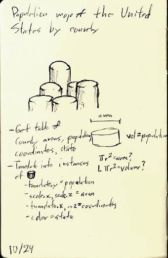
Every large project, especially in computer graphics, involves certain long, tedious, repetitive tasks that would only be noticed in the finished product if absent. On Marboxian I nicknamed this type of work “housekeeping.”

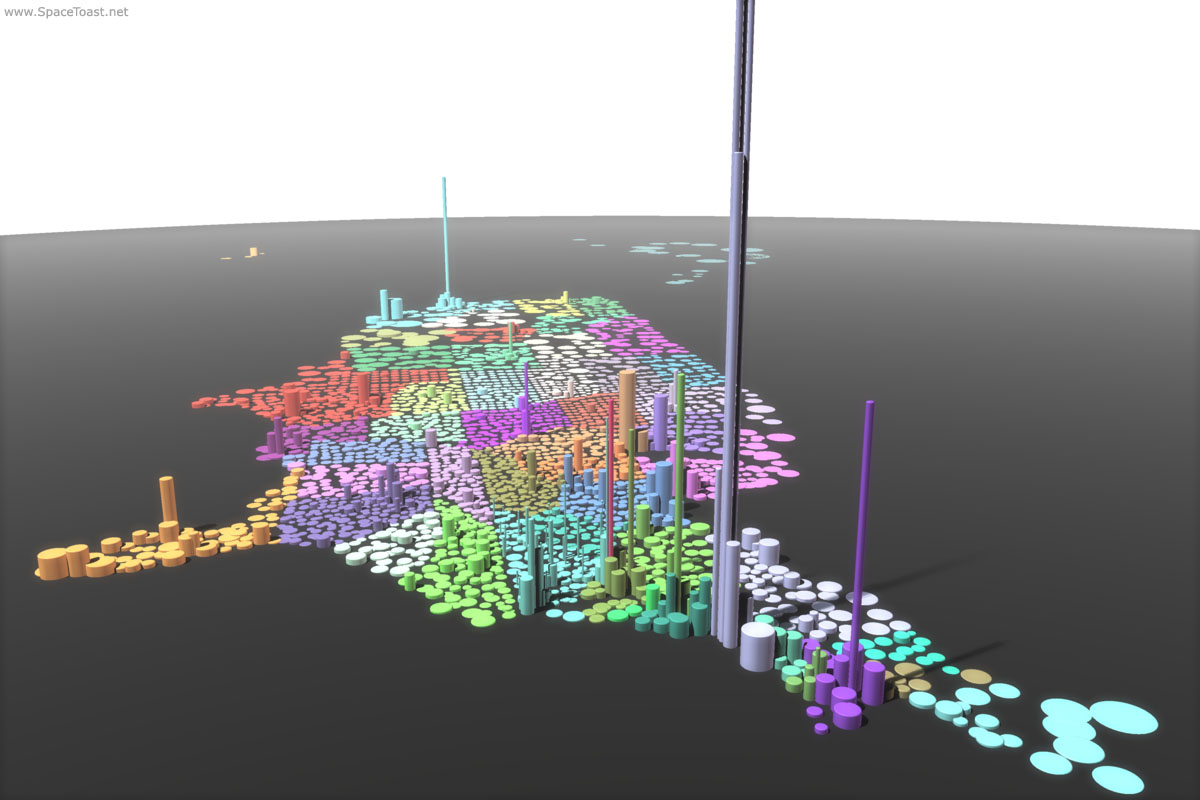
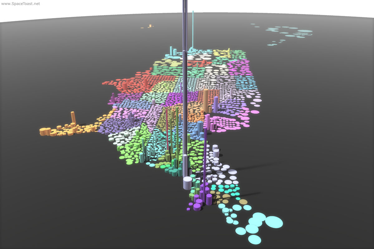
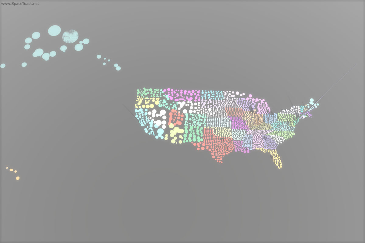
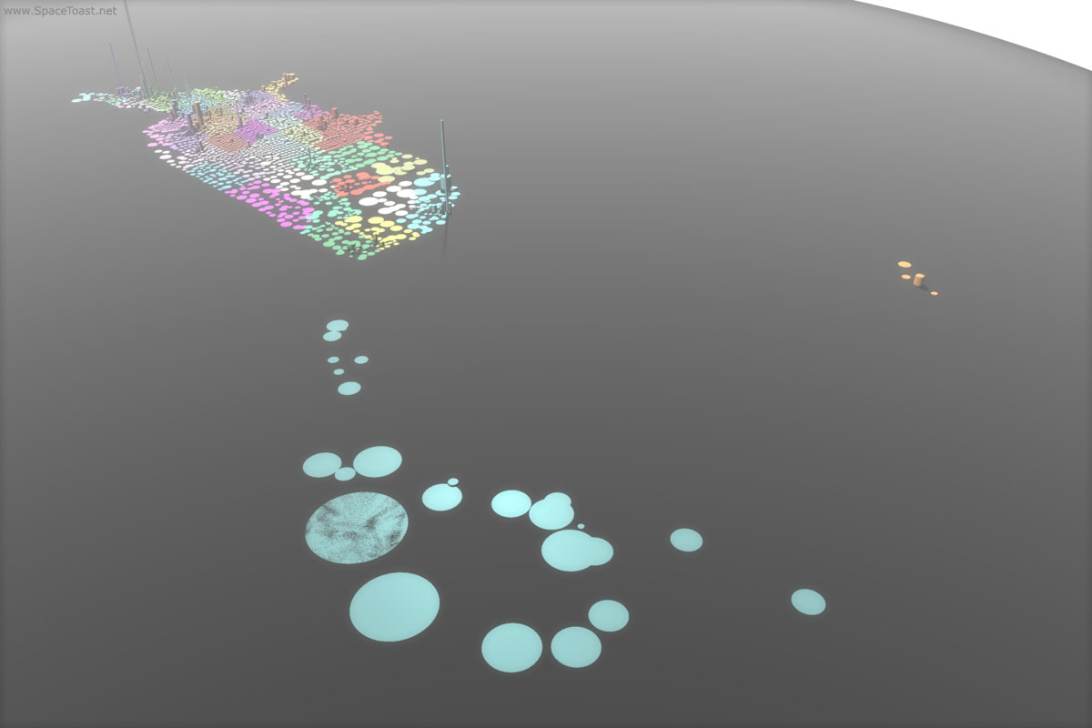
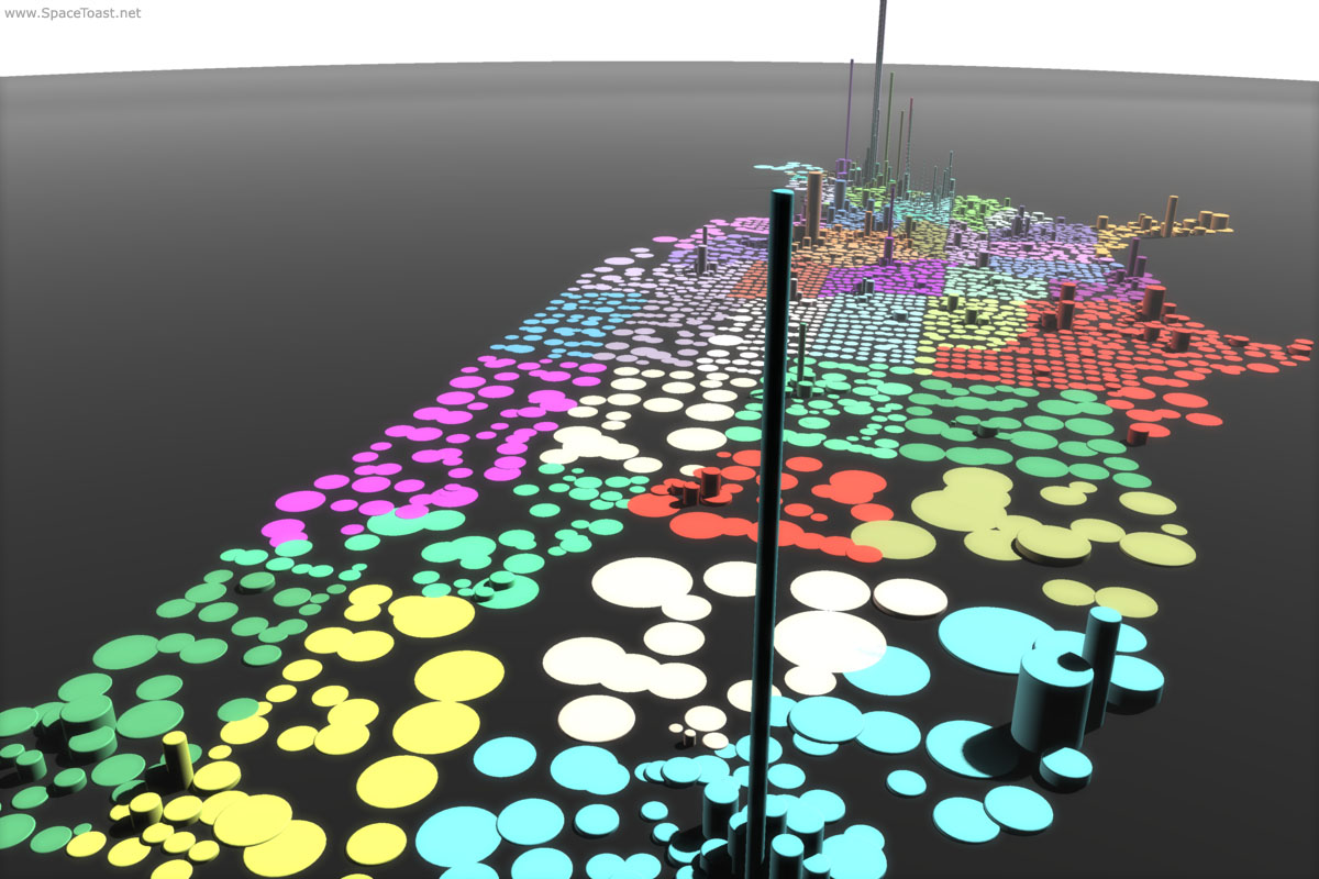
In the case of the Population Map, the latest example is Puerto Rico. If given statehood, Puerto Rico would be our 27th largest state, falling between Kentucky and Oregon. It’s the only United States territory with a significant population — much less that of an average state — which is why I’ve chosen to include it — late — in the otherwise completed map.

The tedium comes from not having a .bna file for the 78 municipios of Puerto Rico, which I could use with my standard script to determine their geographic coordinates. Instead, I’ve had to manually enter each into the Open Street Map and copy their URLs to a table.

Next I’ll rewrite the script to break the URLs apart into decimal coordinates, but that’ll be brain work, comparatively.

In the meantime, there’s cookies to make.

New Population Map Images

Work on the Population Map continues. Below are some test renders from last night. Click for high-resolution images.

The Animation:Master project file is 5.5MB in size, culled from about 7.5MB of data. Some of the random colors chosen by the script make neighboring states hard to distinguish, which will be corrected in jEdit with find/changes. The enormous Yukon/Koyukuk Census Area in Alaska, with an average of one person every 22.5 square miles, is so close to the ground plane that it’s causing the software to glitch. The fill lighting is perhaps a bit too strong while facing west, and the key a bit dingy overall.

Griping aside, this project is coming along well in my opinion.

Moleskin Notes

These were my original scribbles for the population map project. I try to work as much out on paper as I can before moving to the computer.

Fun With Data

I started work on a project a little while ago, and it’s probably past time I started blogging it. My intention was to produce a population map of the United States, county by county — essentially, a map of the country’s other topography.

Each cylinder represents one county or equivalent (e.g. an independent city, Louisian parish, or Alaskan census area). The circular area represents the land area, the height its population density, and the volume of each cylinder its population. The cylinders are instanced Animation:Master models generated by a script.

The population and land area data come from the U.S. Census Bureau web site. Location data is approximated from Census Burea .bna outline files made available on the Princeton web site by Robert Sedgewick and Kevin Wayne of the 2004 Election “Purple Map” fame.

The first version of the script could build one state at a time. With 254 counties, the most of any state, this is Texas:

The second could produce an arbitrary number of states with random colors, but each had to be loaded by hand as soon as the script finished with the previous. This is New England, where I was born and raised:

The first version of the script that could construct the entire United States took over 14 hours to run and had several bugs, one of which limited it to 99 counties per state. This is its first output:

Right now, I have debugged the script, analyzed its output for missed counties, and am working at sanitizing the input data to avoid screwups. I hope to have a complete work in progress by the end of the weekend.